Anchor-based Layout in QML
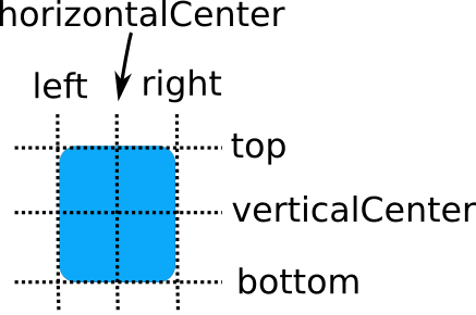
In addition to the more traditional Grid, Row, and Column, QML also provides a way to layout items using the concept of anchors. Each item can be thought of as having a set of 7 invisible "anchor lines": left, horizontalCenter, right, top, verticalCenter, baseline, and bottom.

The baseline (not pictured above) corresponds to the imaginary line on which text would sit. For items with no text it is the same as top.
The QML anchoring system allows you to define relationships between the anchor lines of different items. For example, you can write:
 Rectangle { id: rect1; ... }
 Rectangle { id: rect2; anchors.left: rect1.right; ... }
Each Item has two properties for each anchor line: one to bind from and one to bind to. The properties to bind from are contained in the anchors attached property (seen as anchors.left above). The properties to bind to are normal properties (seen as rect1.right above). This way, each item can have several bindings to the same anchor line. Note that the properties to bind to are not visible in the documentation for Item. So in the example above, the left edge of rect2 is bound to the right edge of rect1, producing the following:

You can specify multiple anchors. For example:
 Rectangle { id: rect1; ... }
 Rectangle { id: rect2; anchors.left: rect1.right; anchors.top: rect1.bottom; ... }

By specifying multiple horizontal or vertical anchors you can control the size of an item. Below, rect2 is anchored to the right of rect1 and the left of rect3. If either of the blue rectangles are moved, rect2 will stretch and shrink as necessary:
 Rectangle { id: rect1; x: 0; ... }
 Rectangle { id: rect2; anchors.left: rect1.right; anchors.right: rect3.left; ... }
 Rectangle { id: rect3; x: 150; ... }

There are also some convenience anchors. anchors.fill is a convenience that is the same as setting the left,right,top and bottom anchors to the left,right,top and bottom of the target item. anchors.centerIn is another convenience anchor, and is the same as setting the verticalCenter and horizontalCenter anchors to the verticalCenter and horizontalCenter of the target item.
Anchor Margins and Offsets
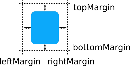
The anchoring system also allows margins and offsets to be specified for an item's anchors. Margins specify the amount of empty space to leave to the outside of an item's anchor, while offsets allow positioning to be manipulated using the center anchor lines. An item can specify its anchor margins individually through leftMargin, rightMargin, topMargin and bottomMargin, or use anchors.margins to specify the same margin value for all four edges. Anchor offsets are specified using horizontalCenterOffset, verticalCenterOffset and baselineOffset.

The following example specifies a left margin:
 Rectangle { id: rect1; ... }
 Rectangle { id: rect2; anchors.left: rect1.right; anchors.leftMargin: 5; ... }
In this case, a margin of 5 pixels is reserved to the left of rect2, producing the following:

Note: Anchor margins only apply to anchors; they are not a generic means of applying margins to an Item. If an anchor margin is specified for an edge but the item is not anchored to any item on that edge, the margin is not applied.
Restrictions
For performance reasons, you can only anchor an item to its siblings and direct parent. For example, the following anchor is invalid and would produce a warning:
 Item {
     id: group1
     Rectangle { id: rect1; ... }
 }
 Item {
     id: group2
     Rectangle { id: rect2; anchors.left: rect1.right; ... }    // invalid anchor!
 }
Also, anchor-based layouts cannot be mixed with absolute positioning. If an item specifies its x position and also sets anchors.left, or anchors its left and right edges but additionally sets a width, the result is undefined, as it would not be clear whether the item should use anchoring or absolute positioning. The same can be said for setting an item's y and height with anchors.top and anchors.bottom, or setting anchors.fill as well as width or height. If you wish to change from using anchor-based to absolute positioning, you can clear an anchor value by setting it to undefined.