Widgets and Layouts
Widgets
Widgets are the primary elements for creating user interfaces in Qt. Widgets can display data and status information, receive user input, and provide a container for other widgets that should be grouped together. A widget that is not embedded in a parent widget is called a window.
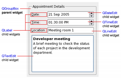
The QWidget class provides the basic capability to render to the screen, and to handle user input events. All UI elements that Qt provides are either subclasses of QWidget, or are used in connection with a QWidget subclass. Creating custom widgets is done by subclassing QWidget or a suitable subclass and reimplementing the virtual event handlers.
Layouts
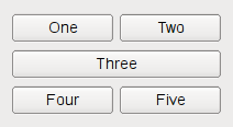
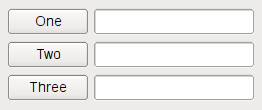
Layouts are an elegant and flexible way to automatically arrange child widgets within their container. Each widget reports its size requirements to the layout through the sizeHint and sizePolicy properties, and the layout distributes the available space accordingly.
|
|
Qt Designer is a powerful tool for interactively creating and arranging widgets in layouts.
Widget Styles
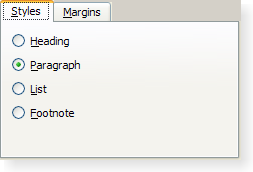
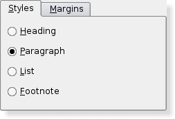
Styles draw on behalf of widgets and encapsulate the look and feel of a GUI. Qt's built-in widgets use the QStyle class to perform nearly all of their drawing, ensuring that they look exactly like the equivalent native widgets.
|
|
|
Qt Style Sheets are a powerful mechanism that allows you to customize the appearance of widgets, in addition to what is already possible by subclassing QStyle.
The Widget Classes
The following sections list the widget classes. See the Qt Widget Gallery for some examples.
Basic Widgets
These basic widgets (controls), e.g. buttons, comboboxes and scroll bars, are designed for direct use.
|
|
|
|
|
|
Checkbox with a text label | |
Combined button and popup list | |
Vista style command link button | |
Widget for editing dates based on the QDateTimeEdit widget | |
Widget for editing dates and times | |
Rounded range control (like a speedometer or potentiometer) | |
Spin box widget that takes doubles | |
Focus frame which can be outside of a widget's normal paintable area | |
Combobox that lets the user select a font family | |
Displays a number with LCD-like digits | |
Text or image display | |
One-line text editor | |
Menu widget for use in menu bars, context menus, and other popup menus | |
Horizontal or vertical progress bar | |
Command button | |
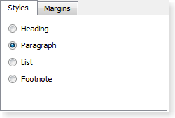
Radio button with a text label | |
Scrolling view onto another widget | |
Vertical or horizontal scroll bar | |
Resize handle for resizing top-level windows | |
Vertical or horizontal slider | |
Spin box widget | |
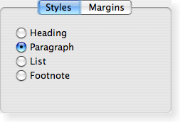
Tab bar, e.g. for use in tabbed dialogs | |
Stack of tabbed widgets | |
Widget for editing times based on the QDateTimeEdit widget | |
Column of tabbed widget items | |
Quick-access button to commands or options, usually used inside a QToolBar | |
The base class of all user interface objects |
Advanced Widgets
Advanced GUI widgets, e.g. tab widgets and progress bars, provide more complex user interface controls.
|
|
|
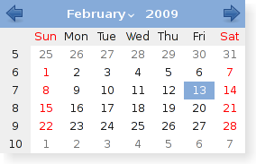
Monthly based calendar widget allowing the user to select a date | |
Model/view implementation of a column view | |
Mapping between a section of a data model to widgets | |
Access to screen information on multi-head systems | |
List or icon view onto a model | |
Widget for Mac OS X that can be used to wrap arbitrary Cocoa views (i.e., NSView subclasses) and insert them into Qt hierarchies | |
Widget for Mac OS X that provides a way to put Qt widgets into Carbon or Cocoa hierarchies depending on how Qt was configured | |
Default model/view implementation of a table view | |
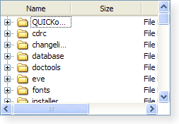
Default model/view implementation of a tree view | |
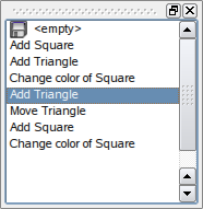
Displays the contents of a QUndoStack | |
Enables embedded top-level widgets in Qt for Embedded Linux | |
Widget that is used to view and edit web documents | |
XEmbed container widget | |
XEmbed client widget | |
Widget that is used to display video |
|
|
Organizer Widgets
Classes like splitters, tab bars, button groups, etc are used for organizing and grouping GUI primitives into more complex applications and dialogs.
Container to organize groups of button widgets | |
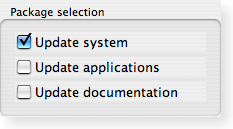
Group box frame with a title | |
Implements a splitter widget | |
Handle functionality of the splitter | |
Stack of widgets where only one widget is visible at a time | |
Stack of tabbed widgets |
Abstract Widget Classes
The abstract widget classes are base classes. They are not usable as standalone classes but provide functionality when they are subclassed.
The abstract base class of button widgets, providing functionality common to buttons | |
Scrolling area with on-demand scroll bars | |
Integer value within a range | |
Spinbox and a line edit to display values | |
The base class of dialog windows | |
The base class of widgets that can have a frame |
