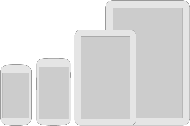
Android powers millions of phones, tablets, and other devices in a wide variety of screen sizes and form factors. By taking advantage of Android's flexible layout system, you can create apps that gracefully scale from large tablets to smaller phones.
Be flexible
Stretch and compress your layouts to accommodate various heights and widths.
Optimize layouts
On larger devices, take advantage of extra screen real estate. Create compound views that combine multiple views to reveal more content and ease navigation.
Assets for all
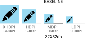
Provide resources for different screen densities (DPI) to ensure that your app looks great on any device.
Strategies
So where do you begin when designing for multiple screens? One approach is to work in the base standard (medium size, MDPI) and scale it up or down for the other buckets. Another approach is to start with the device with the largest screen size, and then scale down and figure out the UI compromises you'll need to make on smaller screens.
For more detailed information on this topic, please visit Supporting Multiple Screens.