ListView is one of Android's most widely used widgets.
It is rather easy to use, very flexible, and incredibly powerful.
ListView can also be difficult to understand at times.
One of the most common issues with ListView happens when you try
to use a custom background. By default, like many Android widgets,
ListView has a transparent background which means that you can see
through the default window's background, a very dark gray
(#FF191919 with the current dark theme.) Additionally,
ListView enables the fading edges by default, as you can
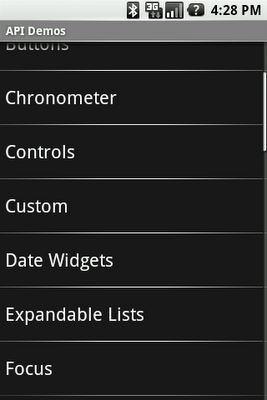
see at the top of the following screenshot — the first text item gradually
fades to black. This technique is used throughout the system to indicate that
the container can be scrolled.

The fade effect is implemented using a combination of
Canvas.saveLayerAlpha()
and the Porter-Duff Destination Out blending mode.
Unfortunately, things start to get ugly when you try to use a custom
background on the ListView or when you change the window's
background. The following two screenshots show what happens in an application
when you change the window's background. The left image shows what the list
looks like by default and the right image shows what the list looks like during
a scroll initiated with a touch gesture:


This rendering issue is caused by an optimization of the Android framework
enabled by default on all instances of ListView. I mentioned
earlier that the fade effect is implemented using a Porter-Duff blending mode.
This implementation works really well but is unfortunately very costly and can
bring down drawing performance by quite a bit as it requires to capture a
portion of the rendering in an offscreen bitmap and then requires extra blending
(which implies readbacks from memory.)
Since ListView is most of the time displayed on a solid
background, there is no reason to go down that expensive route. That's why we
introduced an optimization called the "cache color hint." The cache color hint
is an RGB color set by default to the window's background color, that is #191919
in Android's dark theme. When this hint is set, ListView (actually,
its base class View) knows it will draw on a solid background and
therefore replaces th expensive saveLayerAlpha()/Porter-Duff
rendering with a simple gradient. This gradient goes from fully transparent to
the cache color hint value and this is exactly what you see on the image above,
with the dark gradient at the bottom of the list. However, this still does not
explain why the entire list turns black during a scroll.
As mentioned before, ListView has a transparent/translucent
background by default, and so all default widgets in the Android UI toolkit.
This implies that when ListView redraws its children, it has to
blend the children with the window's background. Once again, this requires
costly readbacks from memory that are particularly painful during a scroll or a
fling when drawing happens dozen of times per second.
To improve drawing performance during scrolling operations, the Android
framework reuses the cache color hint. When this hint is set, the framework
copies each child of the list in a Bitmap filled with the hint
value (assuming that another optimization, called scrolling cache, is
not turned off). ListView then blits these bitmaps directly on
screen and because these bitmaps are known to be opaque, no blending is
required. Also, since the default cache color hint is #191919, you
get a dark background behind each item during a scroll.
To fix this issue, all you have to do is either disable the cache color hint
optimization, if you use a non-solid color background, or set the hint to the
appropriate solid color value. You can do this from code (see
setCacheColorHint(int)) or preferably from
XML, by using the android:cacheColorHint attribute. To disable the
optimization, simply use the transparent color #00000000. The
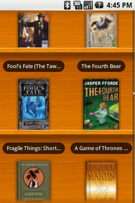
following screenshot shows a list with
android:cacheColorHint="#00000000" set in the XML layout file:

As you can see, the fade works perfectly against the custom wooden background. The cache color hint feature is interesting because it shows how optimizations can make your life more difficult in some situations. In this particular case, however, the benefit of the default behavior outweighs the added complexity..
