This tutorial introduces a variety of widgets that are useful when creating forms, such as image buttons, text fields, checkboxes and radio buttons.
- Start a new project named HelloFormStuff.
- Your
res/layout/main.xmlfile should already have a basicLinearLayout:<?xml version="1.0" encoding="utf-8"?> <LinearLayout xmlns:android="http://schemas.android.com/apk/res/android" android:orientation="vertical" android:layout_width="fill_parent" android:layout_height="fill_parent" > </LinearLayout>For each widget you want to add, just put the respective View inside this
LinearLayout.
Each section below also assumes that your HelloFormStuff Activity has the following
default implementation of the onCreate() method:
public void onCreate(Bundle savedInstanceState) {
    super.onCreate(savedInstanceState);
    setContentView(R.layout.main);
}
Now select which kind of form widget you'd like to create:
Custom Button
In this section, you will create a button with a custom image instead of text, using the Button widget and an XML file that defines three different images to use for the
different button states. When the button is pressed, a short message will be displayed.


- Copy the images on the right into the
res/drawable/directory of your project. These will be used for the different button states. - Create a new file in the
res/drawable/directory namedandroid_button.xml. Insert the following XML:<?xml version="1.0" encoding="utf-8"?> <selector xmlns:android="http://schemas.android.com/apk/res/android"> <item android:drawable="@drawable/android_pressed" android:state_pressed="true" /> <item android:drawable="@drawable/android_focused" android:state_focused="true" /> <item android:drawable="@drawable/android_normal" /> </selector>This defines a single drawable resource, which will change its image based on the current state of the button. The first
<item>definesandroid_pressed.pngas the image when the button is pressed (it's been activated); the second<item>definesandroid_focused.pngas the image when the button is focused (when the button is highlighted using the trackball or directional pad); and the third<item>definesandroid_normal.pngas the image for the normal state (when neither pressed nor focused). This XML file now represents a single drawable resource and when referenced by aButtonfor its background, the image displayed will change based on these three states.Note: The order of the
<item>elements is important. When this drawable is referenced, the<item>s are traversed in-order to determine which one is appropriate for the current button state. Because the "normal" image is last, it is only applied when the conditionsandroid:state_pressedandandroid:state_focusedhave both evaluated false. - Open the
res/layout/main.xmlfile and add theButtonelement:<Button android:id="@+id/button" android:layout_width="wrap_content" android:layout_height="wrap_content" android:padding="10dp" android:background="@drawable/android_button" android:onClick="onButtonClicked"/>The
android:backgroundattribute specifies the drawable resource to use for the button background (which, when saved atres/drawable/android.xml, is referenced as@drawable/android). This replaces the normal background image applied by the system with the drawable created above, which changes its image based on the button state.The attribute
android:onClickspecifies the name of a method in your activity that the system should call when the user clicks the button. You'll create that method next. - To make the button do something when pressed, add the following
method inside your
Activityclass:public void onButtonClicked(View v) { // Do something when the button is clicked Toast.makeText(HelloFormStuff.this, "Button clicked", Toast.LENGTH_SHORT).show(); }When you specify this kind of method, which is used in your layout file with the
android:onClickattribute, the method must bepublic, have avoidreturn value, and accept a singleandroid.view.Viewparameter. When the system calls this method, it passes theandroid.view.Viewthat was clicked. - Now run the application.
Edit Text
In this section, you will create a text field for user input, using the EditText widget. Once text has been entered into the field, the "Enter" key will
display the text in a toast message.
- Open the
res/layout/main.xmlfile and add theEditTextelement (inside theLinearLayout):<EditText android:id="@+id/edittext" android:layout_width="fill_parent" android:layout_height="wrap_content"/> - To do something with the text that the user types, add the following code
to the end of the
onCreate()method:final EditText edittext = (EditText) findViewById(R.id.edittext); edittext.setOnKeyListener(new OnKeyListener() { public boolean onKey(View v, int keyCode, KeyEvent event) { // If the event is a key-down event on the "enter" button if ((event.getAction() == KeyEvent.ACTION_DOWN) && (keyCode == KeyEvent.KEYCODE_ENTER)) { // Perform action on key press Toast.makeText(HelloFormStuff.this, edittext.getText(), Toast.LENGTH_SHORT).show(); return true; } return false; } });This captures the
EditTextelement from the layout and adds anView.OnKeyListener. TheView.OnKeyListenermust implement theonKey(View, int, KeyEvent)method, which defines the action to be made when a key is pressed while the widget has focus. In this case, the method is defined to listen for the Enter key (when pressed down), then pop up aToastmessage with the text that has been entered. TheonKey(View, int, KeyEvent)method should always returntrueif the event has been handled, so that the event doesn't bubble-up (which would result in a carriage return in the text field). - Run the application.
Checkbox
In this section, you will create a checkbox for selecting items, using the CheckBox widget. When the checkbox is pressed, a toast message will
indicate the current state of the checkbox.
- Open the
res/layout/main.xmlfile and add theCheckBoxelement (inside theLinearLayout):<CheckBox android:id="@+id/checkbox" android:layout_width="wrap_content" android:layout_height="wrap_content" android:text="check it out" android:onClick="onCheckboxClicked"/>The attribute
android:onClickspecifies the name of a method in your activity that the system should call when the user clicks the check box. You'll create that method next. - To do something when the state is changed, add the following method inside your
Activityclass:public void onCheckboxClicked(View v) { // Perform action on clicks, depending on whether it's now checked if (((CheckBox) v).isChecked()) { Toast.makeText(HelloFormStuff.this, "Selected", Toast.LENGTH_SHORT).show(); } else { Toast.makeText(HelloFormStuff.this, "Not selected", Toast.LENGTH_SHORT).show(); } }When you specify this kind of method, which is used in your layout file with the
android:onClickattribute, the method must bepublic, have avoidreturn value, and accept a singleandroid.view.Viewparameter. When the system calls this method, it passes theandroid.view.Viewthat was clicked. In this example, theandroid.view.Viewis cast to aCheckBoxto determine whether the widget has been checked or unchecked. TheCheckBoxwidget handles its own state changes, so you only need to query the current state. - Run it.
Tip: If you need to change the state
yourself (such as when loading a saved CheckBoxPreference),
use the setChecked(boolean) or toggle() method.
Radio Buttons
In this section, you will create two mutually-exclusive radio buttons (enabling one disables
the other), using the RadioGroup and RadioButton
widgets. When either radio button is pressed, a toast message will be displayed.
- Open the
res/layout/main.xmlfile and add twoRadioButtons, nested in aRadioGroup(inside theLinearLayout):<RadioGroup android:layout_width="fill_parent" android:layout_height="wrap_content" android:orientation="vertical"> <RadioButton android:id="@+id/radio_red" android:layout_width="wrap_content" android:layout_height="wrap_content" android:text="Red" android:onClick="onRadioButtonClicked"/> <RadioButton android:id="@+id/radio_blue" android:layout_width="wrap_content" android:layout_height="wrap_content" android:text="Blue" android:onClick="onRadioButtonClicked"/> </RadioGroup>It's important that the
RadioButtons are grouped together by theRadioGroupelement so that no more than one can be selected at a time. This logic is automatically handled by the Android system. When oneRadioButtonwithin a group is selected, all others are automatically deselected.The attribute
android:onClickspecifies the name of a method in your activity that the system should call when the user clicks the radio button. You'll create that method next. - To do something when each
RadioButtonis selected, add the following method inside yourActivityclass:public void onRadioButtonClicked(View v) { // Perform action on clicks RadioButton rb = (RadioButton) v; Toast.makeText(HelloFormStuff.this, rb.getText(), Toast.LENGTH_SHORT).show(); }When you specify this kind of method, which is used in your layout file with the
android:onClickattribute, the method must bepublic, have avoidreturn value, and accept a singleandroid.view.Viewparameter. When the system calls this method, it passes theandroid.view.Viewthat was clicked.Because each
RadioButtonwidget is grouped into aRadioGroup, each widget handles its own state changes when a new button is selected. - Run the application.
Tip: If you need to change the state
yourself (such as when loading a saved CheckBoxPreference),
use the setChecked(boolean) or toggle() method.
Toggle Button
In this section, you'll create a button used specifically for toggling between two
states, using the ToggleButton widget. This widget is an excellent
alternative to radio buttons if you have two simple states that are mutually exclusive ("on" and
"off", for example).
- Open the
res/layout/main.xmlfile and add theToggleButtonelement (inside theLinearLayout):<ToggleButton android:id="@+id/togglebutton" android:layout_width="wrap_content" android:layout_height="wrap_content" android:textOn="Vibrate on" android:textOff="Vibrate off" android:onClick="onToggleClicked"/>The attributes
android:textOnandandroid:textOffspecify the text for the button when the button has been toggled on or off. The default values are "ON" and "OFF".The attribute
android:onClickspecifies the name of a method in your activity that the system should call when the user clicks the button. You'll create that method next. - To do something when the user clicks the button, add the following
method inside your
Activityclass:public void onToggleClicked(View v) { // Perform action on clicks if (((ToggleButton) v).isChecked()) { Toast.makeText(HelloFormStuff.this, "Toggle on", Toast.LENGTH_SHORT).show(); } else { Toast.makeText(HelloFormStuff.this, "Toggle off", Toast.LENGTH_SHORT).show(); } }When you specify this kind of method, which is used in your layout file with the
android:onClickattribute, the method must bepublic, have avoidreturn value, and accept a singleandroid.view.Viewparameter. When the system calls this method, it passes theandroid.view.Viewthat was clicked.In this example, the callback method checks the new state of the button, then shows a
Toastmessage that indicates the current state.Notice that the
ToggleButtonhandles its own state change between checked and unchecked, so you just ask which it is. - Run the application.
Tip: If you need to change the state
yourself (such as when loading a saved CheckBoxPreference),
use the setChecked(boolean) or toggle() method.
Rating Bar
In this section, you'll create a widget that allows the user to provide a rating,
with the RatingBar widget.
- Open the
res/layout/main.xmlfile and add theRatingBarelement (inside theLinearLayout):<RatingBar android:id="@+id/ratingbar" android:layout_width="wrap_content" android:layout_height="wrap_content" android:numStars="5" android:stepSize="1.0"/>The
android:numStarsattribute defines how many stars to display for the rating bar. Theandroid:stepSizeattribute defines the granularity for each star (for example, a value of0.5would allow half-star ratings). - To do something when a new rating has been set, add the following code
to the end of the
onCreate()method:final RatingBar ratingbar = (RatingBar) findViewById(R.id.ratingbar); ratingbar.setOnRatingBarChangeListener(new OnRatingBarChangeListener() { public void onRatingChanged(RatingBar ratingBar, float rating, boolean fromUser) { Toast.makeText(HelloFormStuff.this, "New Rating: " + rating, Toast.LENGTH_SHORT).show(); } });This captures the
RatingBarwidget from the layout withfindViewById(int)and then sets anRatingBar.OnRatingBarChangeListener. TheonRatingChanged()callback method then defines the action to perform when the user sets a rating. In this case, a simpleToastmessage displays the new rating. - Run the application.
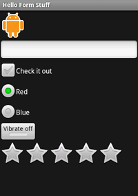
If you've added all the form widgets above, your application should look like this: