Settings is a place in your app where users indicate their preferences for how your app should behave. This benefits users because:
- You don't need to interrupt them with the same questions over and over when certain situations arise. The settings predetermine what will always happen in those situations (see design principle: Decide for me but let me have the final say).
- You help them feel at home and in control (see design principle: Let me make it mine).
Flow and Structure
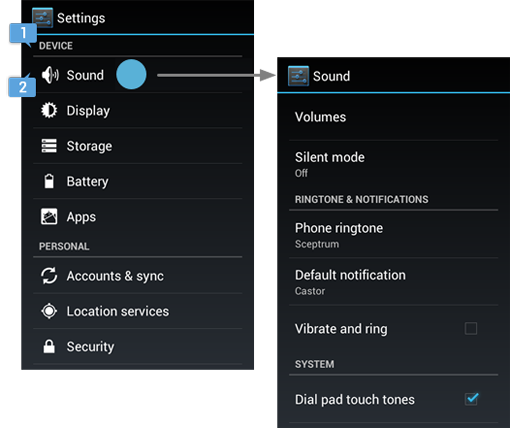
Provide access to Settings in the action overflow
Settings is given low prominence in the UI because it's not frequently needed. Even if there's room in the action bar, never make Settings an action button. Always keep it in the action overflow and label it "Settings". Place it below all other items except "Help".

Avoid the temptation to make everything a setting
Because Settings is a few navigational steps away, no matter how many items you have, they'll never clutter up the core part of your UI. This may seem like good news, but it also poses a challenge.
Settings can be a tempting place to keep a lot of stuff—like a hall closet where things get stashed when you tidy up before company comes over. It's not a place where you spend lots of time, so it's easy to rationalize and ignore its cluttered condition. But when users visit Settings—however infrequently—they'll have the same expectations for the experience as they do everywhere else in your app. More settings means more choices to make, and too many are overwhelming.
So don't punt on the difficult product decisions and debates that can bring on the urge to "just make it a setting". For each control you're considering adding to Settings, make sure it meets the bar:

If you still have lots of settings, group related settings together
The number of items an average human can hold in short-term memory is 7±2. If you present a list of 10 or more settings (even after applying the criteria above), users will have more difficulty scanning, comprehending, and processing them.
You can remedy this by dividing some or all of the settings into groups, effectively turning one long list into multiple shorter lists. A group of related settings can be presented in one of two ways:
Under a section divider
In a separate subscreen
You can use one or both these grouping techniques to organize your app's settings.
For example, in the main screen of the Android Settings app, each item in the list navigates to a subscreen of related settings. In addition, the items themselves are grouped under section dividers.
Grouping settings is not an exact science, but here's some advice for how to approach it, based on the total number of settings in your app.
7 or fewer
Don't group them at all. It won't benefit users and will seem like overkill.
8 to 10
Try grouping related settings under 1 or 2 section dividers. If you have any "singletons" (settings that don't relate to any other settings and can't be grouped under your section dividers), treat them as follows:
- If they include some of your most important settings, list them at the top without a section divider.
- Otherwise, list them at the bottom with a section divider called "OTHER", in order of importance.
11 to 15
Same advice as above, but try 2 to 4 section dividers.
Also, try the following to reduce the list:
- If 2 or more of the settings are mainly for power users, move them out of your main Settings screen and into an "Advanced" subscreen. Place an item in the action overflow called "Advanced" to navigate to it.
- Look for "doubles": two settings that relate to one another, but not to any other settings. Try to combine them into one setting, using the design patterns described later in this section. For example, you might be able to redesign two related checkbox settings into one multiple choice setting.
16 or more
If you have any instances of 4 or more related settings, group them under a subscreen. Then use the advice suggested above for the reduced list size.
Design Patterns
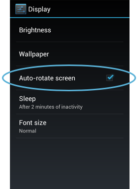
Checkbox
Use this pattern for a setting that is either selected or not selected.
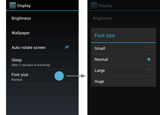
Multiple choice
Use this pattern for a setting that needs to present a discrete set of options, from which the user can choose only one.
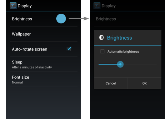
Slider
Use this pattern for a setting where the range of values are not discrete and fall along a continuum.
Date/time
Use this pattern for a setting that needs to collect a date and/or time from the user.

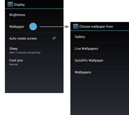
Subscreen navigation
Use this pattern for navigating to a subscreen or sequence of subscreens that guide the user through a more complex setup process.
- If navigating to a single subscreen, use the same title in both the subscreen and the label navigating to it.
- If navigating to a sequence of subscreens (as in this example), use a title that describes the first step in the sequence.
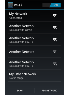
List subscreen
Use this pattern for a setting or category of settings that contains a list of equivalent items.
The label provides the name of the item, and secondary text may be used for status. (In this example, status is reinforced with an icon to the right of the label.) Any actions associated with the list appear in the action bar rather than the list itself.
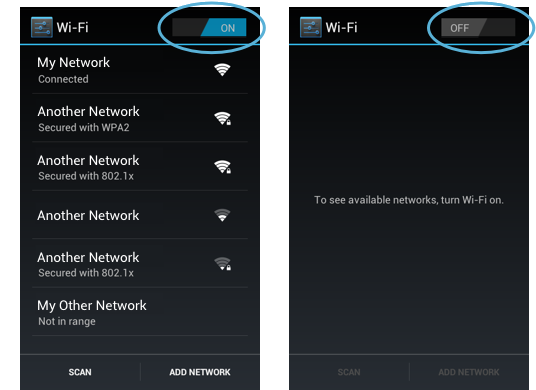
Master on/off switch
Use this pattern for a category of settings that need a mechanism for turning on or off as a whole.
An on/off switch is placed as the first item in the action bar of a subscreen. When the switch is turned off, the items in the list disappear, replaced by text that describes why the list is empty. If any actions require the switch to be on, they become disabled.
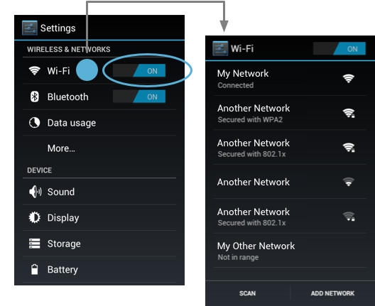
You can also echo the master on/off switch in the menu item that leads to the subscreen. However, you should only do this in cases where users rarely need to access the subscreen once it's initially set up and more often just want to toggle the switch.
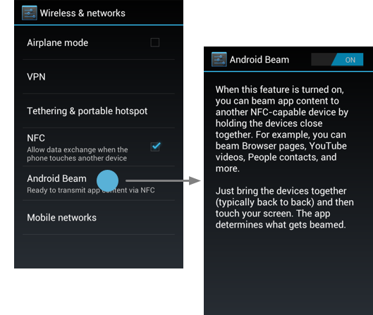
Individual on/off switch
Use this pattern for an individual setting that requires a more elaborate description than can be provided in checkbox form.
The on/off switch only appears in the subscreen so that users aren't able to toggle it without also being exposed to the descriptive text. Secondary text appears below the setting label to reflect the current selection.
In this example, Android Beam is on by default. Since users might not know what this setting does, we made the status more descriptive than just "On".
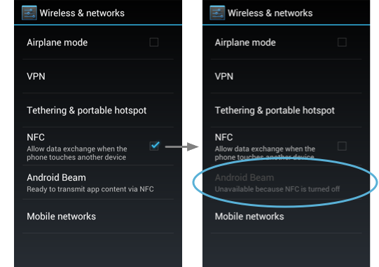
Dependency
Use this pattern for a setting that changes availability based on the value of another setting.
The disabled setting appears below its dependency, without any indentation. If the setting includes a status line, it says "Unavailable", and if the reason isn't obvious, a brief explanation is included in the status.
If a given setting is a dependency to 3 or more settings, consider using a subscreen with a master on/off switch so that your main settings screen isn't cluttered by lots of disabled items.
Defaults
Take great care in choosing default values for each of your settings. Because settings determine app behavior, your choices will contribute to users' first impressions of your app. Even though users can change settings, they'll expect the initial states to be sensible. The following questions (when applicable) may help inform your decisions:
- Which choice would most users be likely to choose on their own if there were no default?
- Which choice is the most neutral or middle-of-the-road?
- Which choice is the least risky, controversial, or over-the-top?
- Which choice uses the least amount of battery or mobile data?
- Which choice best supports the design principle Never lose my stuff?
- Which choice best supports the design principle Only interrupt me if it's important?
Writing Guidelines
Label clearly and concisely
Writing a good label for a setting can be challenging because space is very limited. You only get one line, and it's incredibly short on the smallest of devices. Follow these guidelines to make your labels brief, meaningful, and scannable:
- Write each label in sentence case (i.e. only the first word and proper nouns are capitalized).
- Don't start a label with an instructional verb like "Set", "Change", "Edit", "Modify", "Manage", "Use", "Select", or "Choose". Users already understand that they can do these things to settings.
- Likewise, don't end a label with a word like "setting" or "settings". It's already implied.
- If the setting is part of a grouping, don't repeat the word(s) used in the section divider or subscreen title.
- Avoid starting a label with a negative word like "Don't" or "Never". For example, "Don't allow" could be rephrased to "Block".
- Steer clear of technical jargon as much as possible, unless it's a term widely understood by your target users. Use common verbs and nouns to convey the setting's purpose rather than its underlying technology.
- Don't refer to the user. For example, for a setting allowing the user to turn notifications on or off, label it "Notifications" instead of "Notify me".
Once you've decided on labels for your settings, be sure to preview them on an LDPI handset in portrait to make sure they'll fit everywhere.
Secondary text below is for status, not description…
Before Ice Cream Sandwich, we often displayed secondary text below a label to further describe it or provide instructions. Starting in Ice Cream Sandwich, we're using secondary text for status.
| Screen timeout |
|---|
| Adjust the delay before the screen automatically turns off |
| Sleep |
|---|
| After 10 minutes of activity |
Status in secondary text has the following benefits:
- Users can see at a glance what the current value of a setting is without having to navigate any further.
- It applies the design principle Keep it brief, which users greatly appreciate.
…unless it's a checkbox setting
There's one important exception to the using secondary text for status: checkbox settings. Here, use secondary text for description, not status. Status below a checkbox is unnecessary because the checkbox already indicates it. The reason why it's appropriate to have a description below a checkbox setting is because—unlike other controls—it doesn't display a dialog or navigate to another screen where additional information can be provided.
That said, if a checkbox setting's label is clear enough on its own, there's no need to also provide a description. Only include one if necessary.
Follow these guidelines to write checkbox setting descriptions:
- Keep it to one sentence and don't use ending punctuation.
- Convey what happens when the setting is checked, phrased in the form of a command. Example: "Allow data exchange", not "Allows data exchange".
- Avoid repetition by choosing words that don't already appear in the label.
- Don't refer to the user unless it's necessary for understanding the setting.
- If you must refer to the user, do so in the second person ("you") rather than the first person ("I"). Android speaks to users, not on behalf of them.
Writing examples
The following are examples of changes we made to labels and secondary text in the Settings app in Ice Cream Sandwich.
| Use tactile feedback |
|---|
| Vibrate on touch |
|---|
In this checkbox setting, we eliminated the throwaway word "Use" and rephrased the label to be more direct and understandable.
| Screen timeout |
|---|
| Adjust the delay before the screen automatically turns off |
| Sleep |
|---|
| After 10 minutes of activity |
In this multiple choice setting, we changed the label to a friendlier term and also replaced the description with status. We put some descriptive words around the selected value, "10 minutes", because on its own, the meaning could be misinterpreted as "sleep for 10 minutes".
| Change screen lock |
|---|
| Change or disable pattern, PIN, or password security |
| Screen lock |
|---|
| Pattern |
This setting navigates to a a sequence of subscreens that allow users to choose a type of screen lock and then set it up. We eliminated the throwaway word "Change" in the label, and replaced the description with the current type of screen lock set up by the user. If the user hasn't set up a screen lock, the secondary text says "None".
| NFC |
|---|
| Use Near Field Communication to read and exchange tags |
| NFC |
|---|
| Allow data exchange when the phone touches another device |
In this checkbox setting—although it's technical jargon—we kept the "NFC" label because: (1) we couldn't find a clear, concise alternative, and (2) user familiarity with the acronym is expected to increase dramatically in the next couple of years.
We did, however, rewrite the description. It's far less technical than before and does a better job of conveying how and why you'd use NFC. We didn't include what the acronym stands for because it doesn't mean anything to most users and would have taken up a lot of space.
Checklist
Make sure each item in Settings meets the criteria for belonging there.
If you have more than 7 items, explore ways to group related settings.
Use design patterns wherever applicable so users don't face a learning curve.
Choose defaults that are safe, neutral, and fit the majority of users.
Give each setting a clear, concise label and use secondary text appropriately.